Affinity Maps
Affinity mapping is a tool that helps designers find relationships between elements and to simplify complex information. Groups of individuals are asked a set of questions around a strategic goal and are asked to provide responses to these questions on Post It notes. Participants work alone during this divergent thinking part of the exercise. All participants’ responses are collected, shuffled, and redistributed. Then, the group of participants must work together to organize the responses into groupings of similar ideas. The following diagrams illustrate affinity maps created during four separate workshops. Affinity maps are excellent tools for engaging workshop participants in both divergent and convergent thinking tasks while also providing the framework for interaction and collective activity.
Shepley Bulfinch
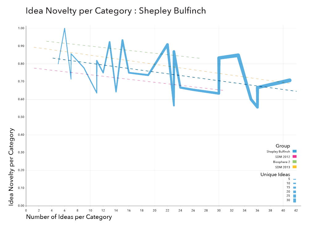
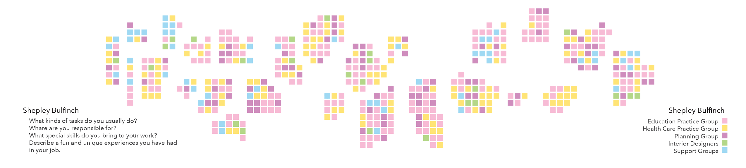
This affinity map was created by a group of workers at an architecture and design firm in Boston, Massachusetts. The goal of the exercise was to define the kinds of roles that individuals played within the organization. To this end, participants were asked to describe the kinds of tasks they were responsible for, the things that they were generally responsible for, and the specific skills that they thought they brought to their work. Upon organizing this information, the group arrived at 25 categories of roles. The resulting diagram is a taxonomy of the work activities that these workers engage in to deliver value.
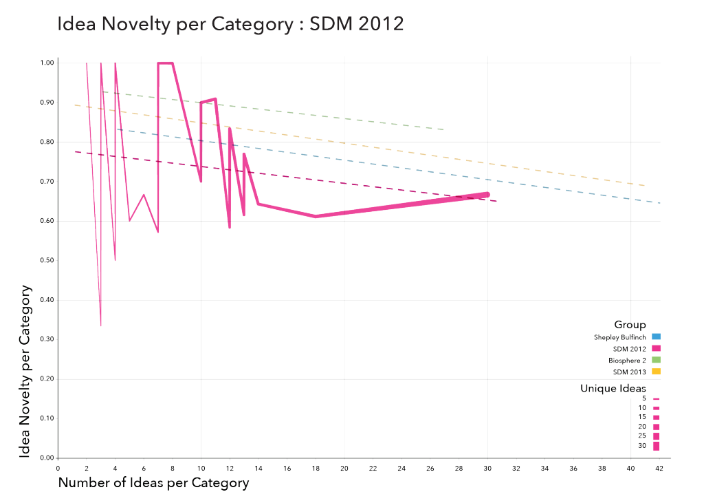
The adjacent diagram charts the novelty of the group’s responses as a whole, and the novelty of responses within a given category. In some ways, these measurement tell us how the group performed in both the divergent and convergent parts of the exercise. A group the has high overall novelty performed well on the divergent thinking part of the exercise, and a group that has high novelty per category performed well on the convergent, or organizing, part of the exercise. Each point on the adjacent line chart indicate the number of responses and the novelty of responses for one of the 25 categories created in this affinity map.
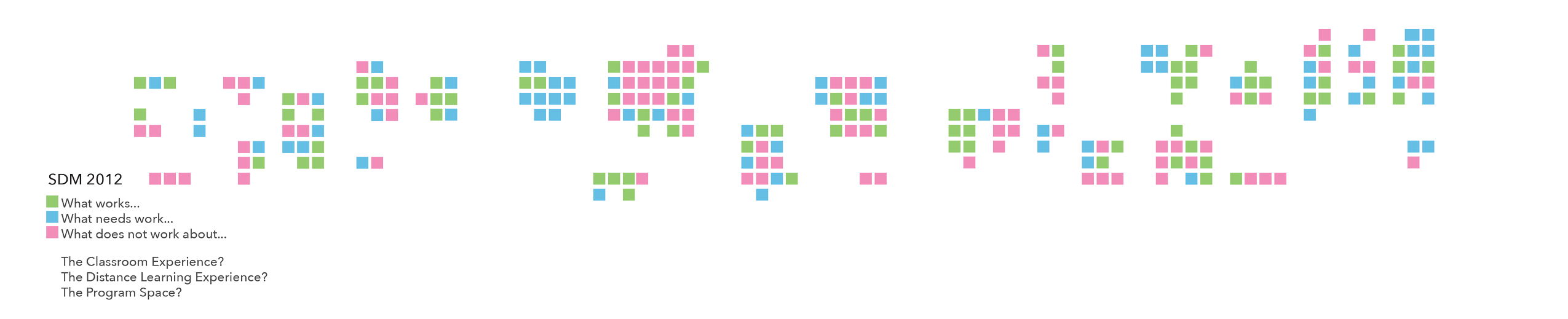
System Design and Management 2012 Cohort
The following affinity map is actually a set of three affinity maps created by students in the System Design and Management program at MIT. These affinity maps were part of a workshop that was designed to allow the students an opportunity to provide feedback on the program directly to the program staff. I worked closely with the program staff to develop the strategic objectives for these affinity maps and it was decided that the most helpful information that the students could provide would be around three main areas of the program: the classroom experience; the distance learning experience, and the student space experience. The students the following questions for each of the three strategic objectives: What works…? What needs work…? and What does not work…? Groups were then asked to chart the relationships between each of the categories to discover root causes and effects.
The outcomes of this workshop provided the program staff with real feedback from their primary stakeholders. The students had plenty of good things to say about each of the strategic questions, but the students also gave constructive feedback for each of the questions and the program staff acted on many of the student’s suggestions. For instance, several of the students concerns regarding the out-dated nature of the student space were incorporated into the redesign of that space before many of those same students left the program.
Biosphere 2
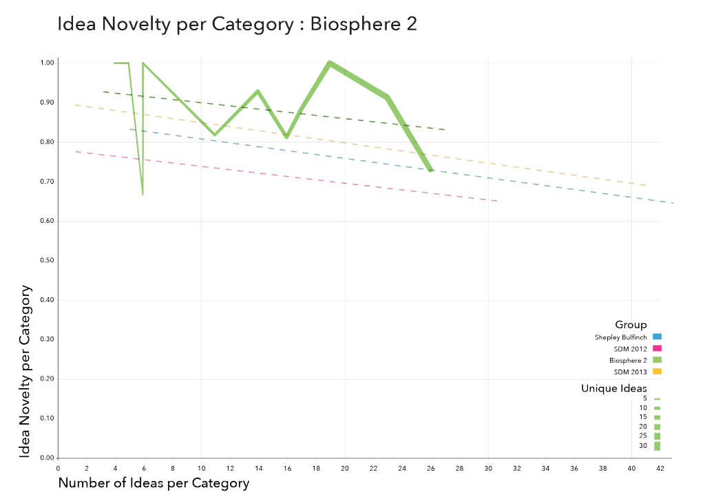
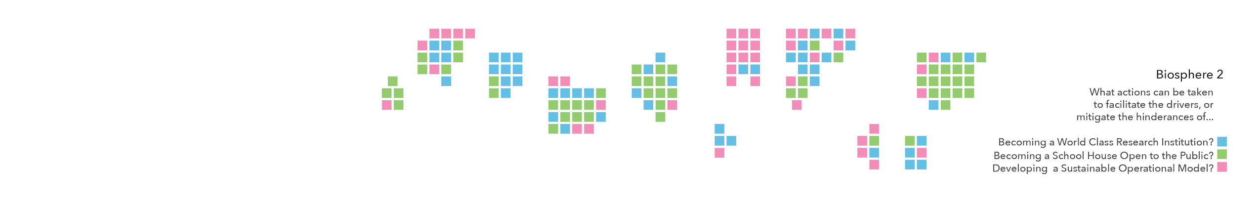
This affinity map was created as part of a stakeholder workshop at Biosphere 2, just outside of Tucson, Arizona. The mapping activity was the last of three exercises designed to explore ways of creating greater sustainability at Biosphere 2. Participants were engaged in a group discussion about the major forces affecting the three pillars of Biosphere 2: To be a world class research institution; To be a school house open to the public; and to be a model of operational efficiency. After this dialogue, workshop participants were asked to think of specific actions that can be taken to either bolster positive changes or mitigate hindering forces. These actions were recorded on Post Its and organized by the entire group into eleven categories.
This group was particularly notable for the high degree of novelty and specificity of the responses. This may be due to the fact that the group was composed of a diverse set of individuals who were each knowledgeable about Biosphere 2 in a certain way and who therefore contributed to the overall diversity of responses. It may also be due to the fact that the exercise immediately preceding the affinity map was a deep dive discussion that was designed to prime the participants for greater specificity in the discussion of actions.
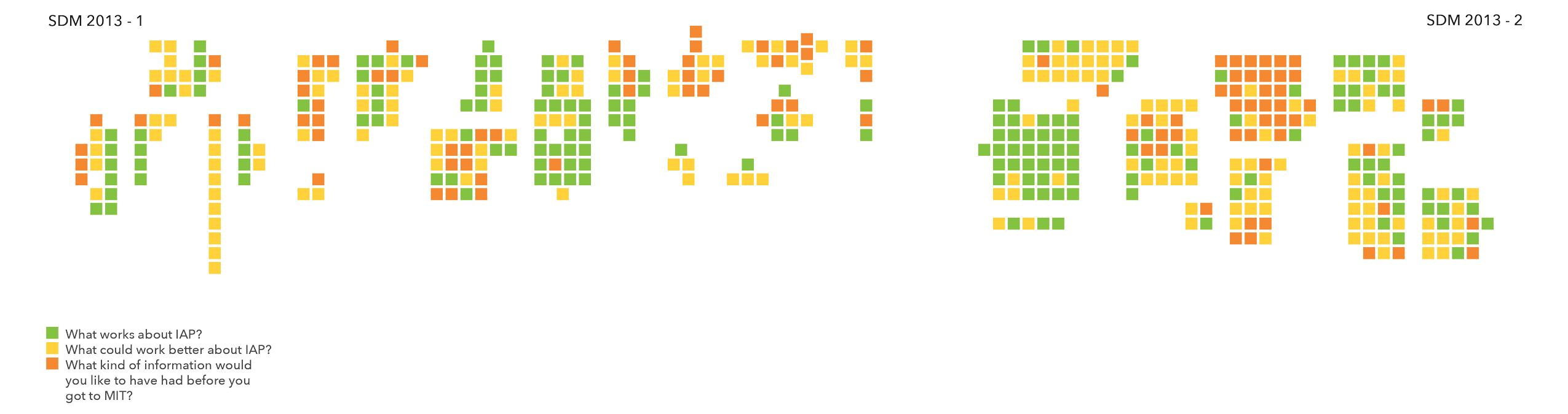
System Design and Management 2013 Cohort
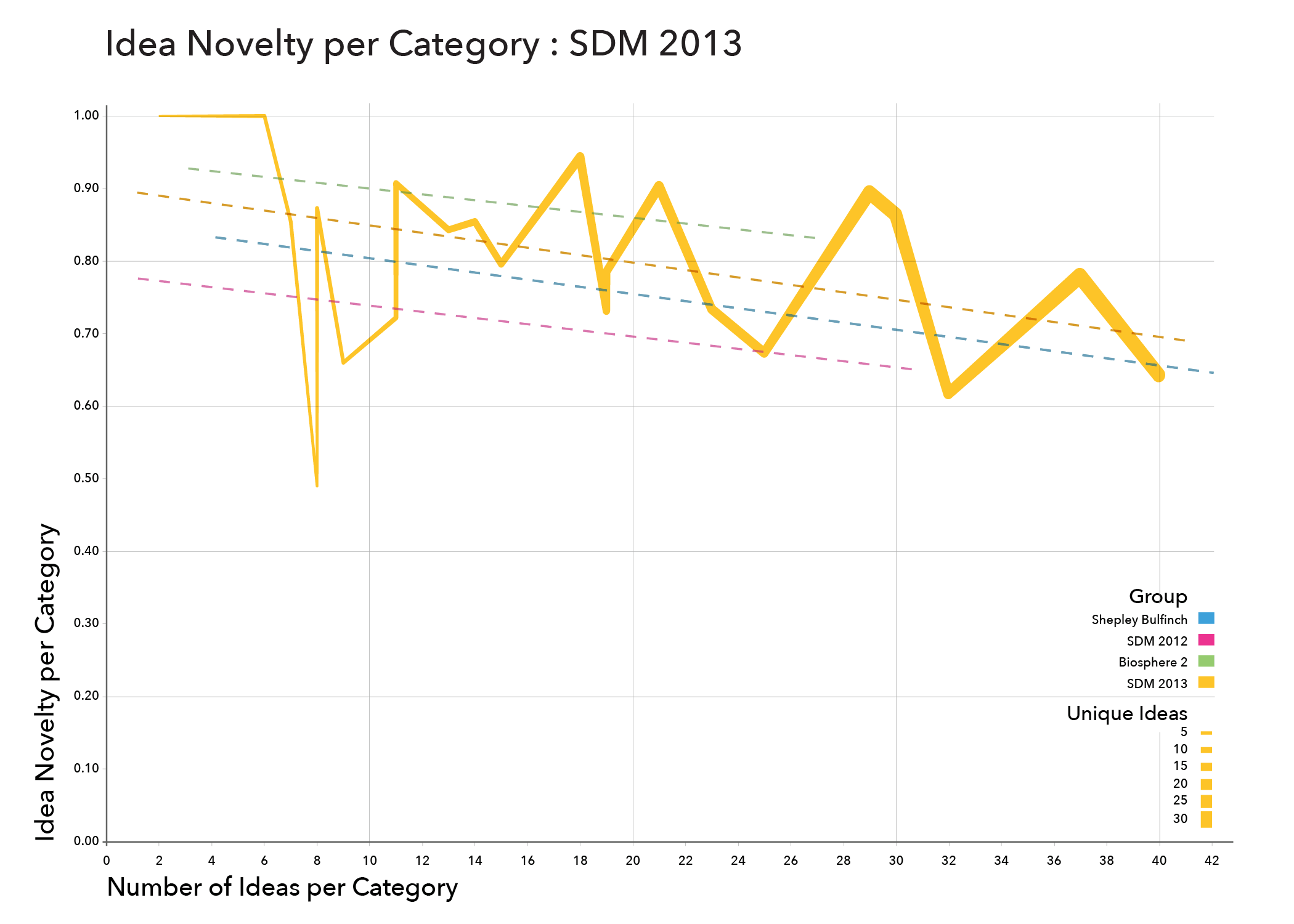 This affinity map was designed as a tool for students of the MIT System Design and Management 2013 cohort to provide feedback on the month-long program introduction and orientation. The students were asked to provide responses about the aspects of the orientation period that worked well, those aspects that did not work well, and areas of the program where they would have liked to have more information. A group of 52 students were given 12 minutes to generate responses. All participants were then split into two random groups and each group was then asked to organize its set of responses into an affinity map.
Dividing the participants and their responses into two groups provides the opportunity for some comparison. Both groups generated about the same number of responses (204 and 232). However, Group One organized their responses into 18 categories with fewer responses per category, while Group Two organized their responses into 11 categories with more responses per category. Additionally, the trend line of Group One’s novelty per category is steeper than the average, and Group Two’s novelty per category is flatter than the average. These two pieces of information suggest that Group One performed better than group two in the convergent (organizing) part of the activity, while Group Two performed better on the divergent part of the exercise.